Challenge
How might we create a platform that makes online sales of products easier and also compel users to continuously visit product site?
My Role
UX Design, Research, Interaction Design, Prototyping, Visual Design
1. Understand
Context
Online vendors need a platform where they can upload their products for sales, having all the full functions and properties of an e-commerce website with full control. The app and website look and feel is one of the most important surface for user retainment.
We have to design to separate interfaces; one for the vendors to manage their site and another for the users to get products from the vendor’s site.
Problem Definition
Out of many issues identified, 2 stood out as clear problems for consumers and the vendors:
- In order to use a product, users frequently feel obligated to identify with it. Most online store applications on the market, however, have failed to deliver this engaging experience for both the store owners and potential buyers.
- Many store owners express dissatisfaction with their ability to account for their finances and track their consumers. The assumption is that one of the main reasons is the lack of a digital database of customers and a bookkeeping service.
Consumer problem:
For people buying products online, getting across to vendors and making sure you get what you want is a frustrating experience due to the inconvenient way of sales that doesn’t provide an up-to-date catalog
Vendor problem:
Maintaining communication with customers is quite difficult due to the large client base, much more the regular updating of the product catalog across all their sales platform
Discovery
Highlights
We unearthed useful insights through usage data, inventory analysis, and user research and came up with some solutions:
- Simplifying the entire process of the store owners uploading a product and buyers getting a product in ‘’just a few clicks’’.
- Being valuable to vendors by helping them keep a handy and searchable catalog of customers, recording of sales and invoices in one place.
- Create a go-to place for both consumers and vendors
2. Gain Confidence
Ideation
With my PM and team, I sketching out a number of different interaction model concepts for desktop, moweb, iOS, and Android.
Together, we discussed pros and cons of each direction, and quickly converged on a hybrid model that would best serve guests’ needs while also supporting the requirements of Airbnb’s different tiers of inventory.
Finally, I prototyped a few different desktop and mobile concepts and my team and I ran light concept testing on each.
Validate + Iterate
Five main categories emerged from my brainstorming and sketching of concepts. I then selected the three I found most intriguing, and they were all centered around the native app:
- Hand-holding : One method used more hand-holding and focused more on each full-screen step.
- Combined Steps: steps were merged in a different directions to speed up the run-through.
- Hybrid – A third strategy was a combination of the first two.
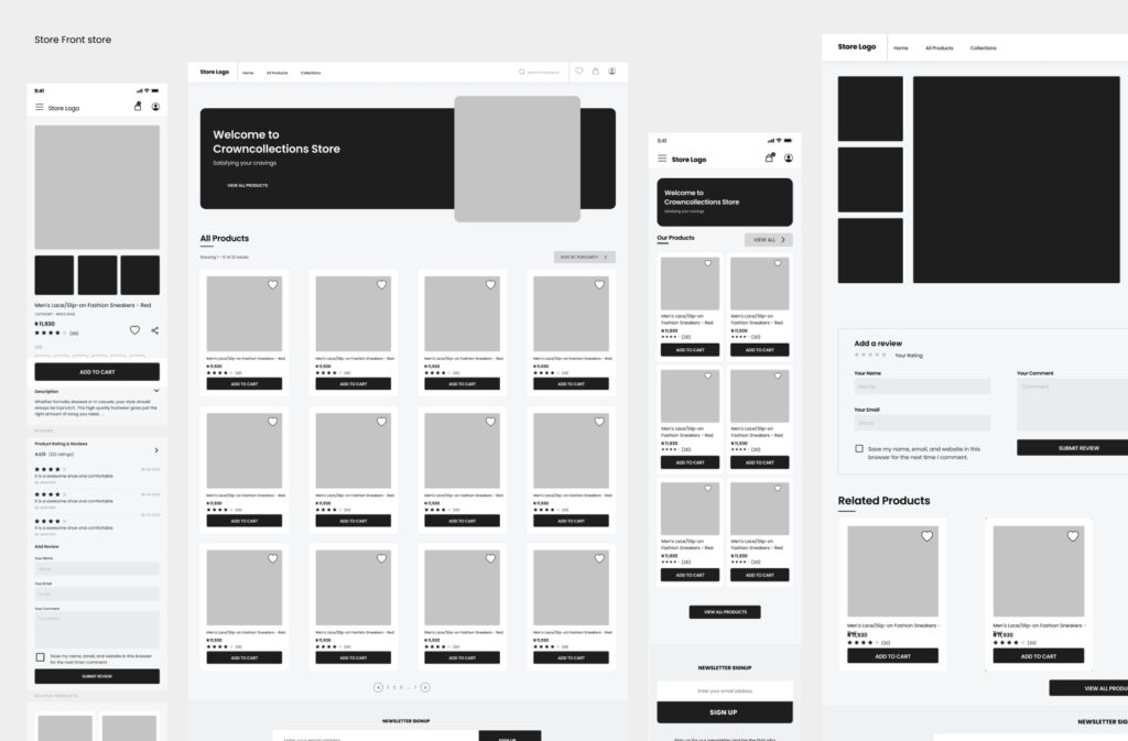
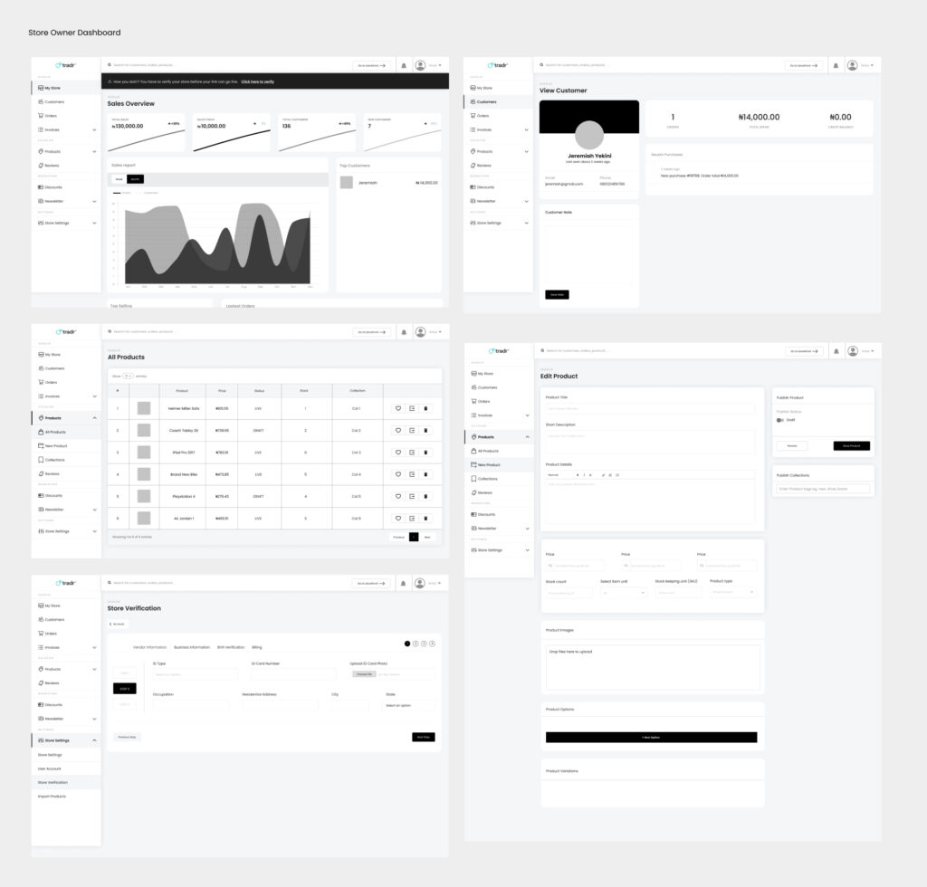
Low fidelity prototype
We created a low-fidelity clickable prototype and tested it out with coworkers. Each participant’s initial goal was to “purchase a product and also upload a product, from start to end,” and we timed how quickly they were able to accomplish this.
Iteration
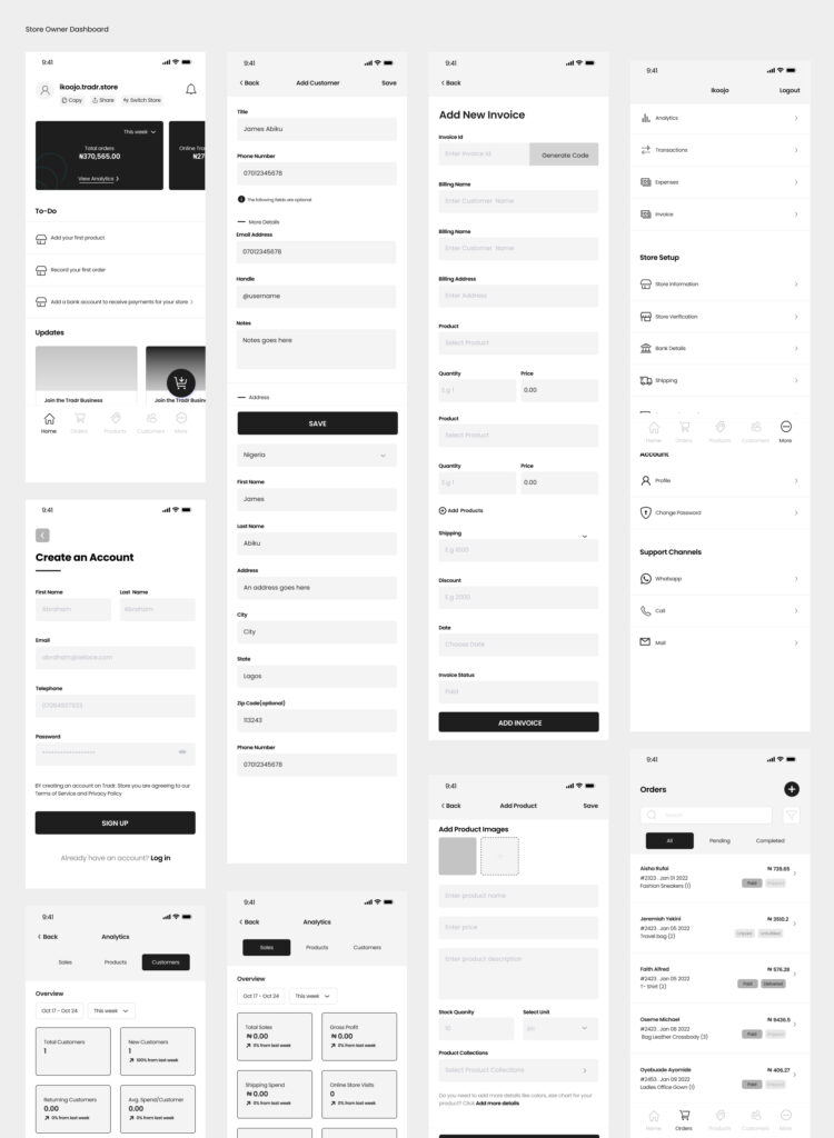
After the initial prototype, we swiftly revised and rebuilt it with a number of tweaks to get closer to a hybrid approach. This strategy seemed to function better because it blended the most effective components of the hand-holding direction with the quick split view strategy, which could assist keep user’ attention focused throughout crucial portions of the journey.
We ran through the prototype many more times, iterating throughout, while also improving transitions between states. We iterated often while running through the prototype, making changes along the way and enhancing state transitions. Finally, I imported everything back into Figma to finish the visual design task.
Customer landing page
Vendor’s Dashboard
3. Polish
Designs & Prototypes
Along with final visual design, I built prototypes in Principle for Mobile and Desktop.
These helped demonstrate how interactions looked and felt, and were also a resource for our engineers.
4. Results
The project was a success on all fronts.
- Awesome user experience – Consumers and vendors research confirmed that guests found it easier to use.
- Most consumers successfully search for and order a product
- Most Vendors successfully Upload a Product
- More people perform product searches after their first order
- Most people complete a second order